Portcullis Media Kit
Portcullis Logo
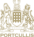
The Potcullis logo serves as a unique graphical symbol serving as the primary identifier for the company and its services. This logo is a registered service mark and holds a central role in corporate communications. Our logo consists of our brand symbol and our logotype.
Logo

Logo mark



Logo type



Brand Colours
Maintaining consistent colours within our brand fosters recognition, trust, and a strong brand identity. When customers encounter our distinct colours repeatedly they start associating them with our brand, creating a mental link that facilitates instant recognition even amidst a sea of competitors.
Palette
Gold
#A39260
R163 G146 B96
C0 M10 Y41 K36
Burgundy
#621A1A
R98 G26 B26
C0 M73 Y73 K62
Charcoal
#333333
R51 G51 B51
C0 M0 Y0 K80
Silver
#B2B2B2
R178 G178 B178
C0 M0 Y0 K30
Typography
Our typographic system utilises a very limited set of typefaces and weights to evoke a sense of simplicity and gravitas. All text should utilise the inter font.
Primary typeface
Secondary typeface
For Chinese typography, we use Noto Sans SC and Noto Sans TC to ensure consistency, clarity, and readability across all Chinese-language communications.
Noto Sans SC
Noto Sans TC
Code/Technical typeface
For code and technical use, we use Maple Mono, an open-source monospace font used for consistent alignment in code and technical documentation.
Maple Mono Regular
ABCDEFGHIJKLMNOPQRSTUVWXYZ
abcdefghijklmnopqrstuvwxyz
1234567890!
@£$%^&*
Maple Mono Semibold
ABCDEFGHIJKLMNOPQRSTUVWXYZ
abcdefghijklmnopqrstuvwxyz
1234567890!
@£$%^&*